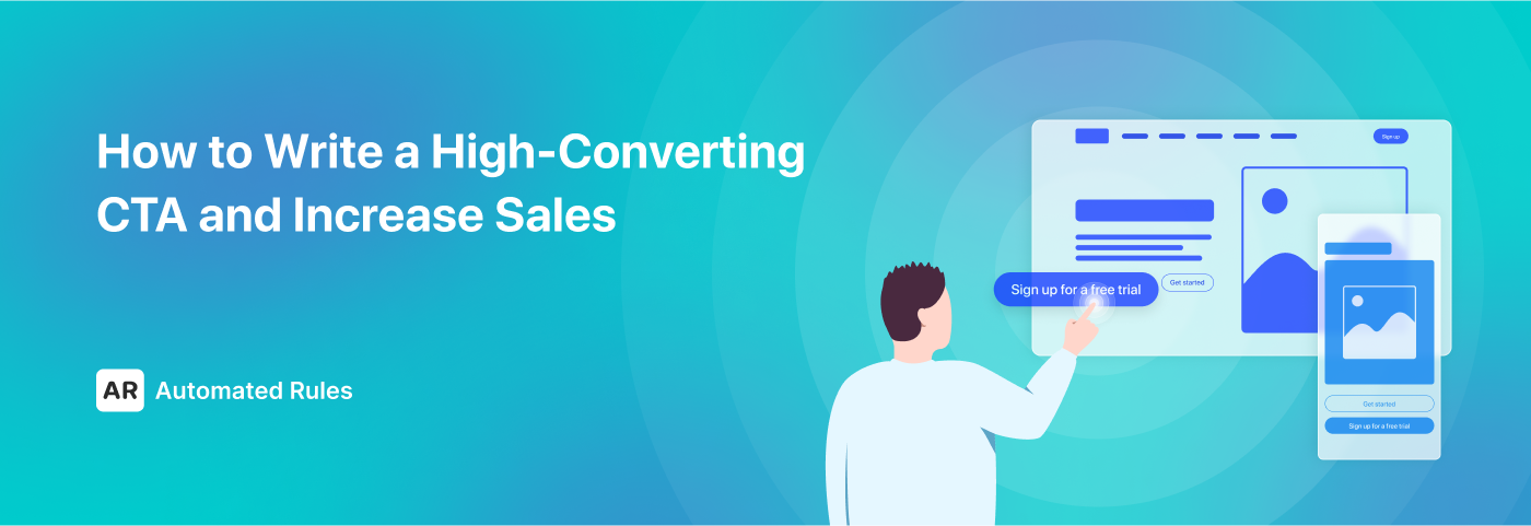
How to Write a High-Converting CTA and Increase Sales
August 16, 2023
In this article, we’re going to explore how to create high-converting CTAs that incentivize your audience to take the desired action.
What is CTA & why is it important?
Each website, landing page, or ad is comprised of various elements that fuse together to provide a smooth user experience and generate conversions.
Small elements also play an important role, and this is especially true for the CTA buttons.
CTA, or call to action, is a “speech, piece of writing, or act that asks or encourages people to take action about a problem”. When applied to digital marketing, CTA is a phrase with a special power to compel users to take action.
Usually, CTA takes the form of a button that can be placed on a website, in an email, or in an ad. However, it can also be a hyperlink or even a text with no link – as long as it encourages users to do something, it is a call to action.
Simply put, CTA is a final persuasion for a user to make a decision, something that can nudge them in the right direction. If you want to lead people all the way up to a conversion, you need to make an inspiring and persuasive CTA.
While every business chooses its own way to interact with its customers, there are some common phrases that are widely used on many websites, in many email campaigns and ads, and so on.
Let’s explore the most prevalent types of CTA separated into two main categories: ‘soft’ CTAs and ‘hard’ CTAs.
Soft CTAs are more subtle and require less commitment. Here are some common examples of soft CTAs:
- Try, Sign Up for Free;
- Get Started;
- Learn More;
- Read or Watch Now;
- Check It Out;
- Explore, See Products;
- Request Quote;
- Follow;
- Subscribe To The Newsletter;
- Download, Get For Free;
- Contact Us, Get In Touch;
As you can see, all of these CTAs use milder language and offer options for users to engage in actions intended for gathering information and exploring. Soft CTAs are often used earlier in the customer journey to nurture engagement and build trust and awareness before pushing for conversions.
Hard CTAs, on the other hand, are more direct and prompt users to take an immediate and specific high-commitment action. Here are the phrases that can be used in hard CTAs:
- Subscribe
- Add to cart, Reserve;
- Book Now, Schedule Appointment;
- Buy, Shop, Order;
- Get A Discount, Claim Your Offer;
- Join;
- Apply.
Hard CTAs use action-oriented language and are aimed primarily at warm audiences who are already familiar with your business and might have engaged with it before. They are designed to drive conversions and other tangible results, and they often include words that highlight the urgency of offers (e.g. “now”, “today”, “last chance”, etc.).
Now that we understand what a typical CTA might look like, let’s consider specific tips and tricks that can help us make our CTAs more compelling.
How to create highly effective CTAs
Multiple studies show that in general, users are quickly scanning the information on website pages rather than fully reading it. However, it is possible to catch users’ attention by making certain elements, in particular your CTA buttons, stand out.
A CTA button is part of an overall design, and all of its characteristics – size, color, shape, placement, microcopy – should complement each other and fit the surrounding environment while making the button distinct enough at the same time.
Let’s see how we can work on each of these characteristics to create a CTA button that gets you clicks and conversions.
#1 CTA’s microcopy
The text of the CTA button should catch users’ attention and lead them to take a specific action depending on your conversion goal. Writing a high-converting CTA can be considered a form of art: it takes mastery to give your audience a clear and compelling incentive in 5 words or less.
It may sound a bit hard to achieve, but luckily, there are some simple tips that can help you write a convincing CTA.
№1 Keep it brief & simple
On average, a call-to-action is expressed in 4-5 words or less: this is an optimal length to attract users’ attention without exhausting them with too much text.
Take the most commonly used CTAs as examples: “Start your free trial”, “Get 50% off”, “Add to cart”, and so on. As they say, brevity is a virtue, and it’s even more true considering how little time people take to scan a website’s page.

“Get started” is a short yet perfect phrase to take users on a journey to explore a service via a low-commitment action like signing up for a free trial (example: Brilliant).
However, being concise also means that you should choose your words wisely, which brings us to the next tip.
№2 Be precise and clear
When writing the text for your button, you need to consider these two main questions:
- Why should users click on this button?
- What are they going to get after clicking on it?
Answering these questions will help you write a CTA that will clearly explain the benefits of clicking on your button (what’s in it for your audience?) and what exactly is going to happen after (what’s the end result?).
For the sake of clarity and conciseness, you can use command verbs like “buy”, “download”, “get”, “sign up”, etc. You can also consider shifting the focus from what a user should do to the benefits they’re going to receive.
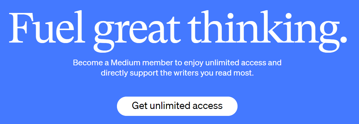
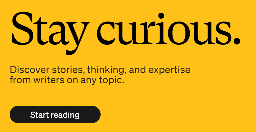
You can make your CTA button more relevant to the intended audience if you focus on the benefits they’ll get by taking the action or highlight the level of commitment it will take (Example: Medium)
Adding specific details can help with that, but remember that your CTA shouldn’t be too wordy. For example, microcopies like “Learn more about X”, “Get your free copy”, and “Buy now with a discount” will be straight-to-the-point and direct enough.
№3 Personalize
When the market is oversaturated with offers not that different from yours, it can be hard to be unique. However, with the right amount of personalization, you can establish a close relationship with your audience and foster a sense of familiarity in them.
You can make your CTA button feel more personal by using pronouns like “I”, “me”, “my”, “your”, and so on.
Shifting the voice to the first person’s POV often works better: people are more ready to take action if a button appeals to them personally and puts an emphasis on their subjectivity.
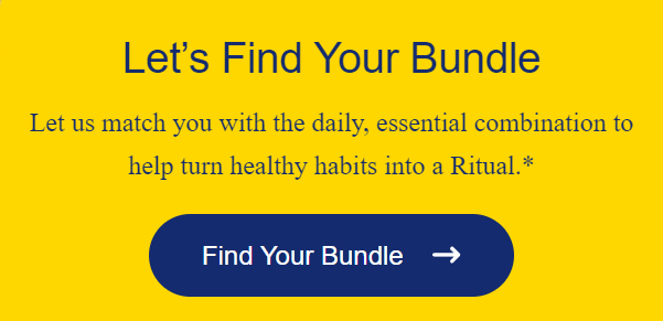
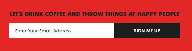
Appealing to users as individuals who make their own choices can shift the tone of your CTAs and turn them into a form of personal communication instead of simple imperatives (Examples: Death Wish Coffee, Ritual)
When you’re personalizing your CTAs, always remember that the microcopy should fit the tone of voice used elsewhere on the website. If your TOV is on a more formal side, you might want to tone your personalized CTAs a bit down to ensure consistency in your communication style.
№4 Spark curiosity and appeal to feelings
If you want your CTA to really call to your audience, you can use an emotional appeal to make it more actionable. In order to choose the right words, you need to know your target audience really well: what motivates them? What pain points do they have? What do they like? Which trends do they follow? And so on.
For example, one of the most common methods used in marketing is appealing to people’s FOMO or the fear of missing out. Marketers love to capitalize on this feeling, and you can do it too by emphasizing the time-limited nature and exclusivity of your offers.
(Example: Asda)
Besides missing out on discounts and deals, people also fear missing opportunities to make their lives better, which means that you can appeal to their desire for improvement in your CTA’s microscopy.
And don’t forget about the opportunity to write special CTAs for particular occasions (e.g. holidays): this can help you leverage both the FOMO and the desire to feel the festive atmosphere of your potential customers.
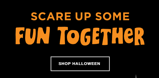
Making your CTAs more unique and aligning them with your brand’s personality and your audience’s tastes and desires can be a great way to make your buttons more clickable (Example: Hallmark)
In a nutshell, if you manage to figure out the emotional ‘buttons’ of your customers, you’ll be able to write better microcopies for your CTAs and make buttons that are too good not to be clicked on.
№5 Make it easier to click
In the age when countless opportunities freely present themselves online, there’s always a risk of being misled by ambiguous offers or finding yourself being affected by decision fatigue.
That’s why the majority of people are not ready to commit as readily and quickly as you might like. They need to be assured and motivated to take action which should not be too high on commitment.
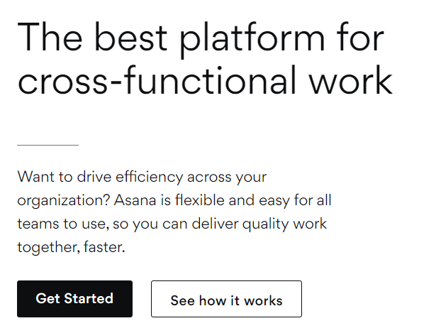
Providing an opportunity to choose between high and low-commitment actions helps you to kill two birds with one stone, giving options for both warm and cold audiences (Example: Asana)
Giving people the freedom to simply explore their options (with the help of secondary and fallback CTAs) instead of pushing them to convert from the get-go allows you to engage users who aren’t ready to convert just yet and remove possible friction on their journey to conversion.
#2 CTA’s design and placement
As a book is often judged by its cover, your website or landing page will be judged by its design among other things. This means that your CTA buttons should also be designed well to contribute to a good first impression and generate conversions.
Multiple case studies have compared different CTA buttons against each other and concluded that some shapes or colors bring more conversions. However, generalizations like these aren’t really helpful.
First of all, things change, and trends and people’s preferences change as well. Secondly, each website has its own style that aligns with the brand’s image and personality, which means that specific shapes and colors will fit better than others.
When you’re trying to answer a question about how your CTA button should look, you need to consider the whole picture. Which shapes and colors will fit well on your website or landing page? What will your audience like more?
Let’s try to find possible answers to these questions together.
Shape & Color
In general, the best (and the most common) shape for a CTA button is a rectangle with rounded corners as smooth lines make the button blend into the environment. However, other shapes (like rectangles or ellipses) can work well too if they fit the overall design.
When it comes to the color, your goal is to make your button noticeable enough to catch users’ eyes but also complement the overall design of the page. You can choose a contrasting color that fits the color palette of the page or the section, make your button transparent, add a shadow or a gradient if you want to make it more visually distinct, and so on.
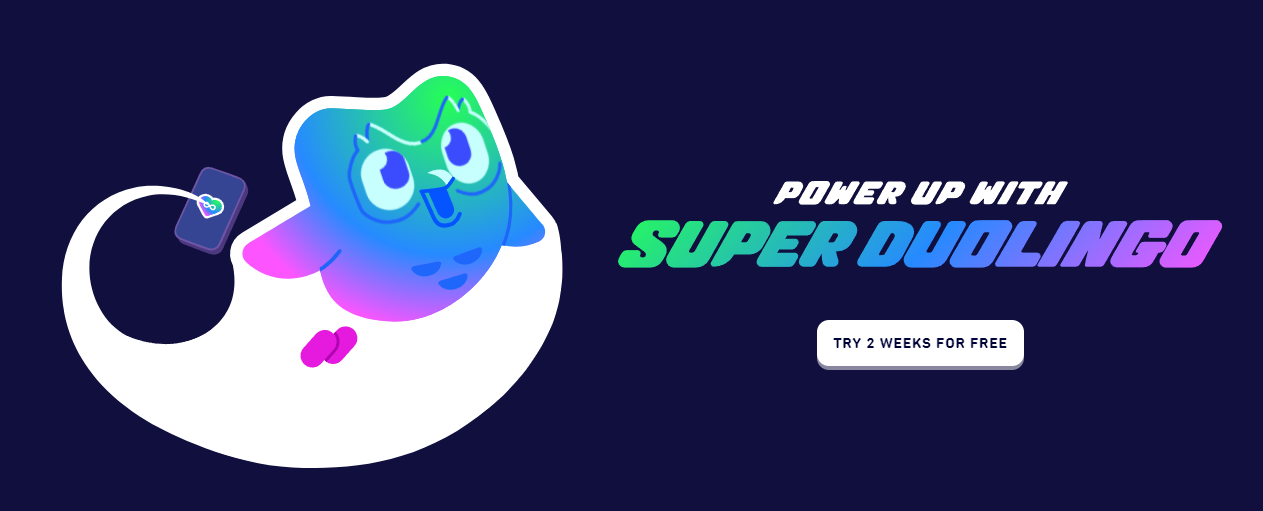
If you want to see examples of simple but well-done CTA buttons, take a look at Duolingo’s website: the button contrasts nicely with background colors and functions as an integral element of the visual design as a whole.

Louis Vuitton’s website incorporates a lot of visual elements, which makes it logical to choose a CTA button that blends in and doesn’t distract from high-quality pictures and videos.
In short, there are many possibilities to create a good-looking and clickable button – you just have to discover what will work best in your case. Remember, though, that it’s better to not go overboard and that less is more when it comes to UX/UI design.
Size & Placement
The size of your button should be big enough to draw attention but appropriate in terms of the overall layout’s proportions. In general, the best size for a CTA button lies somewhere between 42 and 72 pixels, with bigger sizes being preferred more by older users.
Also, keep in mind that if you’re placing several buttons together (e.g. primary and secondary CTA buttons), there should be enough inactive space between them so that users won’t accidentally click on the wrong button. As this can be quite a nuisance for mobile users, make sure that your buttons are properly spaced apart on both desktop and mobile versions of your website.
There’s no right or wrong when it comes to placing several CTA buttons together: what matters most is what works better for your target audience, so make sure to conduct A/B tests to figure this out (Example: Lululemon)
As for the placements of your CTA buttons, remember that they should not be just visible (which can be achieved via selecting the right shape, color, and size) – they have to capture viewers’ attention. If you choose the wrong spot for your button, the users might not notice it even if it has the best shape and color. This means fewer clicks and fewer conversions.
The place where the button will fit best should be determined by the decision-making process and logic of user experience. In general, the higher the commitment an action will require (e.g. in the case of purchasing something expensive), the lower the button should be placed.
That’s why it’s important to consider the structure of a landing page, an ad, or an email template: is it built to lead people down through the sales funnel? How many elements surround the CTA button? These questions will help you determine which button placements will make more sense in terms of user experience and where your button will be the most visible.
One possible solution is to use several CTA buttons: it could be one button at the top, one at the bottom, and (optionally) one in the middle. You can make one button stronger in terms of how it looks and the action it urges users to take, i.e. make it primary while keeping the secondary button more subdued.
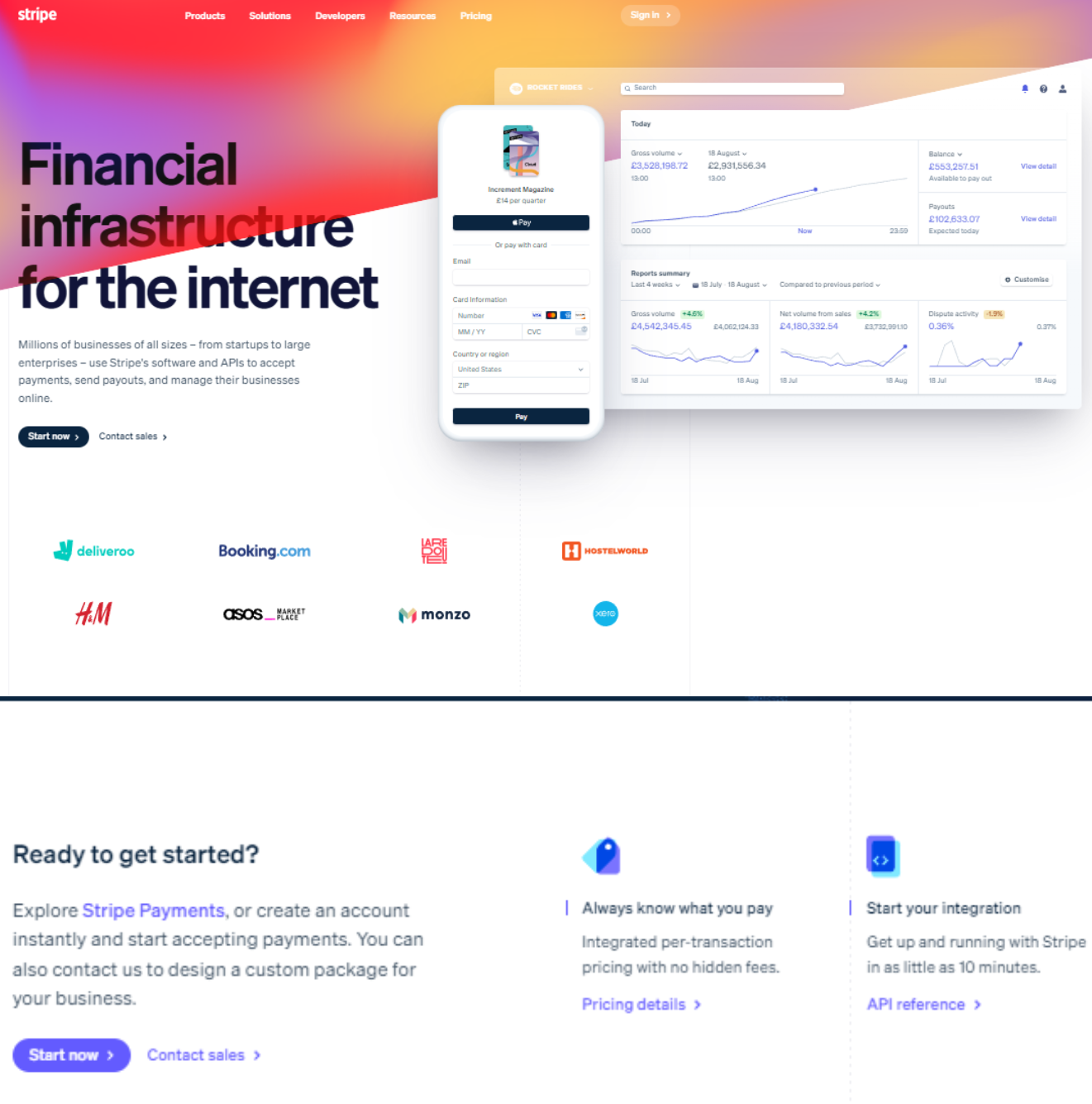
Stripe’s landing page has 4 CTA buttons: 2 at the top of the page and 2 at the bottom. In both cases, a combination of a primary and a secondary button provides enough options for users, while two placements help to make sure that users won’t miss the buttons no matter where on the landing page they might be.
Sometimes, however, even the perfect button is not enough. This can be true when your landing page or an ad has too many elements that can sway users’ attention, or just when you need users’ eyes to be exactly where you want them to be. In this case, you can draw even more attention to your button by using a directional cue, for example.
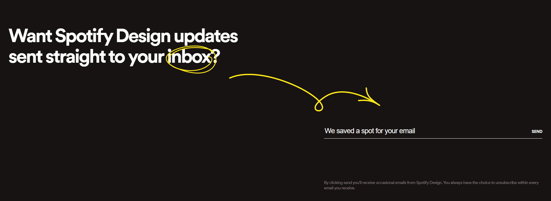
The “Send” button on Spotify Design’s website is pretty low-key, but thanks to the colorful accents you won’t miss it.
With all that being said, remember that a simple at first glance CTA button is a perfect example of two different worlds – one of marketing and one of UX/UI – colliding together. New research is conducted every day, and people’s preferences evolve at the same speed as the digital space, which means that it’s probably better to have your hand on the pulse of these changes and keep up with the latest discoveries.
Don’t forget about doing your research as well: A/B testing and experimentation are essential for figuring out what your audience likes and creating CTAs that will appeal to them.
Conclusion
We hope that all of these tips will help you create compelling CTAs that bridge users’ interests and the results you expect, driving both the conversions and the satisfaction rate up.
Finally, let’s recap what we’ve learned so far in this article. A good CTA:
- Can be easily found on a website, in an ad, in an email, etc.;
- Seamlessly integrates within user experience while also drawing attention;
- Aligns with the tastes and expectations of the target audience;
- Clearly states what the desired action is;
- Uses compelling language that motivates users to take said action;
- Leaves users with an option to decline or take alternative action.
It may be hard to create a CTA that will score all points if you’re just a beginner, but practice makes perfect, so keep exploring and testing different possibilities to find what works best for you.
And if you’re looking to test CTAs for your ads, consider leveraging ad automation tools like AutomatedRules to make the testing process a lot easier. By setting just a couple of rules, you can easily pause or scale your ads based on how they perform, allowing you to test multiple versions without a hassle.